Tuesday, 28 August 2012

Make a good use of your daily 'RUBBISH'

Toilet tissue roll, plastic bottle, plastic spoon...
Are these your daily/weekly rubbishes? How you dispose them?
throw into a dustbin? Don't !!!
they are 'Golden materials' for creating some creative artworks and decoration.
First, we look at toilet paper roll..

TOILET PAPER ROLL WALL ART.


CHERRY BLOSSOM ART FROM A RECYCLED BOTTLE.


SOLAR BOTTLE BULB.


PLASTIC SPOON ROSE


These are very creative and out of my imagination, especially the last artwork, a rose necklace,it is very beautiful, almost same with the necklace which sold in market.
Actually, a majority of our daily rubbishes can be recycled or reused,even if food residue also can be reused as fertilizer.

 I will not belittle rubbishes anymore and try to be more appreciate them, because a lot of useless items can be transformed into wonderful creations.Actually we can play with our creativity , try to explore more uses of different kinds of rubbishes, we will found that there are many more awesome DIY ideas that we've missed.
The rubbishes really can ''REBIRTH'' if we can use it very well.=)


reference:
Lina, Jun 13th 2012, 20 creative DIY Project Ideas, http://www.boredpanda.com/creative-diy-project-ideas/

Thursday, 23 August 2012

Mickey Mouse is a rabbit ??!!!

Mickey Mouse used to be a rabbit?!
Yes!!!
This is an article I read from a website.I was really shock when I saw this interesting article.

Oswald the Lucky Rabbit was the first creation of The Walt Disney Company Archives.It was one of the most iconic animated figures of all times.


The reason why Oswald the Lucky Rabbit has been replaced by Mickey Mouse is because the contract dispute.

Oswald The Lucky Rabbit has followed an interesting path over the past 85 years. In a contract dispute with his partner at Universal on the east coast, Walt Disney lost the rights to Oswald, which contributed to the creation of Mickey Mouse. 
Walt Disney designed Mickey Mouse on the way back on the train to Hollywood and sent telegrams to his brother to tell about this unfortunate thing. Actually he was truly devastated on that time, but he didn't know that the little mouse will push him to the peak!

There are some differences between Oswald and Mickey, but the similarities are striking .
Both share wide white eyes, red shorts and big ears.

I was really admired Walt Disney after I read that article.He could bring into play with his creativity very well in a very short time or even at last minute, this is what I admire and what I can't do.
He was calm and didn't show any panic on the time he lost Oswald.He didn't give up , instead ,created a very cute and attractive mouse.If I were him, I truly will stuck on that emergency time.><
Walt Disney can play in his creativity ANY TIME, ANY WHERE, can I do that?
 This is what I should learn from him!!=)


reference: 

AndrewWine,Jun19,2012,What Came Before Mickey Mouse: Oswald the Lucky Rabbit
http://www.nbcchicago.com/entertainment/television/What-Came-Before-Mickey-Mouse-159556645.html


Saturday, 18 August 2012

Colorful 3D house paper models

These are some colorful 3D paper models with calender rotation.The calender is on the huge window, we can turn the calender to any month we want,is so creative! Perfect ,amazingly cute and creative with the houses!
I always feel excited looking for some DIY / papercraft artworks.So, when the time I saw this series of models, I was attracted by them. The colorful and creative design of the houses definitely worth a space on your table!It is not only a calender but can also be a decoration on table.

After looking this series of  models, I think my 3D cube assignment will be more challenging if I set this as my target. Although I can't do it as beautiful as the houses, but I will take this for a reference.May be I can reference to the colors because I think the colors of the houses are matched  very well and present comfortable feeling, because they are warm colors.

Friday, 10 August 2012

PLAY WITH SCALE!

When composing photographs, we can play with the scale, whether true or false.This technique can catch the attention of viewers to look at our photo.For example, a person standing in front of the Grand Tetons would represent a true sense of scale, and a person appearing taller than a building, which you can achieve by photographing from a low angle, would be a false sense of scale. 
True Sense of Scale

False Sense of Scale

False Sense of Scale
For me, I like the false sense of scale more,because it looks more creative.We can play with distance between 2 objects, angle and even the types of objects which will on camera.A well composition and proportion can create an amazing and creative photo. We can do what we can't do in our life, such as taller than KLCC, use 2 fingers to catch up a human, kiss the person we love,hit the person we allergic to  ...
I hope I can try this kind of photography technique in my year 3 photography course!=)

Wednesday, 1 August 2012

Let's play some 'Kuso' with famous paintings!

British "Daily Mail" June 25th news, an artist, Alon Zaid has used some different kinds of vegetable as his raw material to produce exquisite mimic creative artworks through his ingenious matching and stitching skill! Alon Zaid used the vegetables which we can always see in our daily life,such as potatoes, cabbage, broccoli and aubergine.


It's really creative and attractive. The artist skillfully used the vegetables and composed a creative ''famouspaint''. Actually this is just a very simple idea, but this idea won't thought crossed our mind as we didn't be accustomed to play with our creativity.
A very simple and common material can produce a perfect artwork, I think I should always remind myself about this theory, It's not only an action of environmental protection, but also good in saving money(cheap(may be free) materials can produce an amazing work),so, I will try it!=)

Tuesday, 24 July 2012

Fujiko F.Fujiko , a children's happiness maker


''AN AN AN tottemo daisuki DORAEMON''Do you still remember this lyric?is it fimiliar to you?yes!is Doraemon theme song!=DDoraemon accompanied us in our growth,but do you know who created this cute robotic cat? Is Fujiko F. Fujioand his partner Fujiko Fujio (A).Actually the authors of this comic are them,their group name is Fujio Fujiko(no A and F). but after few years,  they decided to disband ,so they started releasing individual works under different names, Abiko as Fujiko Fujio (A) (藤子不 二雄 Fujiko Fujio Ē?), and Fujimoto as Fujiko F. Fujio (藤子F不二雄 Fujiko Efu Fujio?). Doraemon kept drawn by Fujiko F.Fujio.He is the person I admire the most !His infinite ideas created the myriads of gadgets, medicines, and tools from Doraemon's pockets, how can a human kept on creating different gadgets with different functions for 27 years(from 1969 until 1996)?But Fujiko F.Fujiao could do that.His love of comic and art inclined him towards the success of Doraemon,and became children's happiness maker.Why his creativity always infinite? Did he hit a bottleneck before? How could  he create 1344+++ stories (just for Doraemon, not include other comic) in his whole life?How could he imagine about 1300++ tools and the functions ?That's why I admire him so much,because it's out of my hand and of course is out of your hands too,right?=)He leaved his home and struggle to realize his dream.From him, i have learned that his will power,love of art and of course his unlimited creativity which ordinary people can't do.=)
Fujiko F . Fujiko and his partner, Abiko (Fujiko Fujio .A )


Wednesday, 18 July 2012

Amazing photoshop skill~!


Photo manipulation is the art of image editing techniques to photographs in order to create an illusion or deception, through analog or digital means. It is a type of digital art that absorbs photography, illustration, and graphic design all at the same time. Photo manipulation is popular because it gives a realistic view of an unreal picture, you should have an open mind when gathering ideas on how to get creative with your images. Photo manipulations are also a great source for inspiration, generally because designers can express their creativity through various aspects of design.
So let us take a look at some amazing examples of digital photo manipulation artworks by great Photoshop artists from around the world.


wow!after I have browsed this website, I shook my head and had a sigh for shame>< I think I suppose to iiiiiiiiimprove my photoshop skill??
Anyway, what I have learned from these awesome artworks and the artists is their creative idea. They have tried to put in the idea which u can't imagine.,especially the last picture, this is the work i like most~!

Monday, 9 July 2012

Mc Donald's through the years!

May be you don't know Marrybrown , may be you don't know BBQ plaza,or may be you have forgotten what is A&W, but it is impossible that u don't know Mc Donald!
when you think about fast food, the first thing which will appear in your mind is Mc Donald..when you think about french fries, Mc Donal's,!when you think about hamburger, Mc Donald again!
why?why Mc Donald can be successful? how did the chain grow from a single restaurant into the famous corporation it is today? The reason is the creative mind of the promoters and executors of McDonald!The creativity of this corporation is broad.They always can get what the crowd want, then renew their menu,  launch a series of  continuity promotions,always introduce new food.from Happy meal to chicken Mc Nuggets;from mc nuggets to mc flurry;from mc flurry to premium salad' from premium salad to snack wrap;from premioum salad to Chipotle BBQ......how many new recipe they have introduced since 1940(the year Mc Donald started).that's why Mc Donald can always attract people. Besides, the creative advertising is also one of the reason cause McDonald become famous.Sometimes a simple design can leave a deeper impression in human's mind, McDonald is the best example!


seriously, that's why i will choose McDonald when i stand between McDonald and KFC!>< I admire  McDonald's originator and advertising lay out designer enormously.Now a day, if you really want to monopolize the whole particular market,you are suppose to diversify you promotion!I have learn somethings from McDonald!=D

http://www.franchisedirect.com/information/trendsfacts/mcdonaldshistory/8/1112/
http://www.toxel.com/inspiration/2010/01/06/clever-and-creative-mcdonalds-advertising/

Sunday, 8 July 2012

creative things / products


Here are the pictures i have found from internet.
There are a lots of creative things that we can't imagine, but actually the design concept of these products is very simple.


After I browsed the website, I discovered that most of the designers use the concept of combination to create a looked simple but very creative product.
For example: 1st picture--flower pot + fruit basket
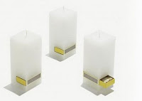
                   3rd pic--candle + match
                   4th pic--belt + waistline
                   5th pic--stove + charcoal
                   6th pic--stair + shoe rack
                   7th pic--sofa + tire
                   8th pic--sponge +''mic''(for those who always be a 'singer' when they taking a bath=) )
                   9th pic--table + chair
                   11th pic--umbrella + umbrella (for the lovers=) )
                   13th pic--trolley + chair

The combination of two thing is a very good idea in design.This is not only convenient and also save space.May be I can try this skill in future=)


Monday, 25 June 2012

Pop up books!!

Now a day, the pop up skill is universal. We always can see the pop-up cards, pop-up story books in our surrounding world...
Pop up books can bring added dimensionality to the flat, printed page. The picture that coming outward can give reader a surprise, especially the pop up card, it really can make receiver be moved when he/she received a handmade DIY pop up card with full of sincerity.
The visual effect of the technique of pop up attracted my group to have a try of this skill in our story book project, so I tried to find some reference resource in Popular book shop.
But what really made me shocked and disappointed was I can’t found any creative pop up books from that book shop. This made me thought of the creativity of Malaysians. Why Malaysians got an unusually low score for creativity? Is this because of the environment and the education’s system? Or the development of science and technology?
Anyway, I sincerely hope that pop up story books and card would not be a strange thing for children in this generation.=)


Thursday, 21 June 2012

Amazing street art!

amazing street art. These 3D street artists gives graffiti a whole new meaning – one that departs from the conventional interpretation of graffiti as vandalism in the form of images and letters scrawled on public property. Artists like Kurt Wenner, Eduardo Relero and Tracy Lee Stum create street art that is so incredible it is almost impossible to pass by without being sucked in to the worlds they create on asphalt and concrete surfaces.


Did you see that?The amazing street art.It is unbelievable that the artists can make a normal , flat and rough surface street becomes a 3D and attractive street art!
Actually street art is a universal art in European countries,but it still not very popular for the Asian, such as our mother country , Malaysia. I think the art atmosphere in Malaysia is not strong, may be it's because of the system of education here, we're just put particular emphasis on  academic, it has stopped the expression of human's creativity.
If i really saw street art in Malaysia one day, I would probably excited! In addition, I think this kind of art is a time consuming and laborious task, it really can test our patience, but the most important is we suppose to be very creative! I think I must be more patient creative in my future artworks.=)